Hey, Blackmoon did some pretty awesome stuff with their website. It's redesigned and investing in Blackmoon's funds was never easier.
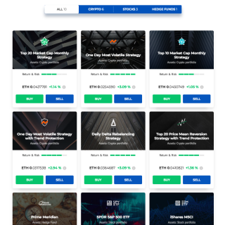
Investor experience and convenience are paramount for Blackmoon. To better serve our clients, we released a new layout of the website. With this layout, investors can easily see available assets, their performance and buy/sell without leaving the main page.
Here is a screenshot of the new layout:
New Showcase Layout
“It has never been easier to pick an investment for my portfolio”
“You guys are doing an amazing job in design and UX”
“Nice and easy!”
These are the comments that we received from the first users. Although we must admit that some comments were like this one:
“Now I finally get what Blackmoon is doing!”
Summary of changes:
Showcase of the investment products on the front page.
More relevant information on the product cards.
Buy and sell buttons added to the product cards.
As before, a click on a card opens the product page with in-depth information.
Visit platform yourself at blackmoonplatform.com and send your feedback in live chat or post a comment to this article. Your feedback helps us to serve you better and deliver you the easy access to trade innovative investment products.
Handy links to stay tuned to our updates:
website: blackmoonplatform.com
telegram chat: https://t.me/blackmooncryptochannel
info video: https://youtu.be/6Ii0XckQOAE
DISCLAIMER
Investment in crypto currencies carries a high degree of risk and volatility and is not suitable for every investor; therefore, you should not risk the capital you cannot afford to lose. Please consult an independent professional financial or legal adviser to ensure the product meets your objectives before you decide to invest. Regional restrictions and suitability checks apply.

